
Navigation menus communicate a website’s underlying structure, explains the World Wide Web Consortium (W3C) in its Menus Tutorial. For directory owners and developers, that structure deserves careful planning. When hundreds of links appear without useful groupings, visitors must work out which destinations match their needs. Adding more links should therefore prompt a review of how people find them.
The directory interface at Juso On-gil (주소온길), a website navigation platform (웹사이트 탐색), provides a contextual example through its category listings, search field, filters, and sorting control. These visible features illustrate different routes into a collection, rather than establishing its usability. To design your own directory, connect information architecture, interface behavior, and structured listing data around tasks visitors actually need to complete.
A Step-by-Step Guide to Designing Directory Navigation
Build the navigation in stages. First understand the audience, then organize the collection, develop retrieval tools, and test the resulting journeys. Treat the following steps as a practical workflow, with opportunities to revise earlier decisions.
1. Identify user needs before drawing menus
The Government Digital Service recommends learning who users are, what they want to accomplish, and what difficulties they encounter. Begin with interviews and observation. Ask participants to find a resource they genuinely need, rather than asking whether they like your proposed homepage.
Record the terms they use and the details they consider important. A student seeking free learning materials may need different filters from a developer comparing software tools. Turn those observations into specific tasks, such as finding a beginner course available in a preferred language.
2. Create logical categories and consistent records
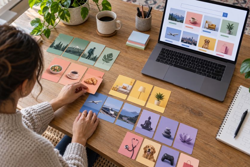
A case study published by Digital.gov describes using card sorting to understand how users group content, followed by tree testing to check the proposed hierarchy. Apply that approach with representative directory entries. Let participants suggest groupings before testing your own category labels.
Choose descriptive labels such as “Education” or “Document Tools” when research supports them. Define what belongs in each category. For an entry spanning several subjects, store one canonical record and associate it with relevant categories rather than maintaining separate copies.
Specify required fields before importing listings: title, destination URL, description, category, language, and review date. Add optional attributes only when they support a demonstrated user need. Write an editorial checklist so contributors apply the same definitions.
3. Implement keyword search, filters, and sorting
The W3C guidance on Multiple Ways identifies search and navigation links as possible methods for locating pages. For a directory, provide keyword search alongside category browsing. Specify which record fields are searchable, then test realistic queries against the returned results.
Offer filters based on reliable attributes, such as language or service type. Show active selections, the result count, and a clear reset action. Provide sorting options with explicit labels, such as alphabetical order or date added. Avoid describing results as “best” without explaining the ranking method.
Plan the empty state too. When nothing matches, preserve the query and suggest removing a filter or checking spelling. Define whether selecting several values within one filter broadens or narrows the results, and communicate that behavior consistently.
4. Design menus people can operate
The W3C Web Accessibility Initiative recommends meaningful menu structure, recognizable visual states, and dropdowns operable with a keyboard. Use semantic navigation regions and lists. Give controls accessible names and make their expanded or collapsed state available to assistive technology.
Keep primary destinations visible and label the current location clearly. Apply the broader principles of user-friendly website design by making each next step easy to understand. For nested categories, consider breadcrumbs and category landing pages. Test opening, closing, and moving through menus without a mouse. Do not make hovering the only way to reveal essential links.
5. Adapt navigation for mobile and zoom
The W3C Reflow guidance describes presenting ordinary vertically scrolling content at a width equivalent to 320 CSS pixels without losing functionality or requiring horizontal scrolling. Test your directory at that width and with enlarged text. Check menus, listing cards, filters, and pagination together.
Keep search easy to locate. If filters move into a collapsible panel, show whether selections remain active. Check touch controls against applicable target-size requirements and spacing exceptions, rather than assuming a visually large icon has a sufficiently large interactive area.
6. Test performance and maintain the collection
Repeat the tree-testing approach described by Digital.gov, then observe participants using the working interface. Track task completion, wrong turns, and unclear labels. Include mobile and keyboard journeys. Use findings to prioritize changes, then retest tasks that previously caused difficulty. Set a baseline before making revisions, so later rounds can show whether the same tasks become easier.
Keep the structure useful as the directory grows
Assign responsibility for reviewing links, descriptions, and category assignments. Schedule checks and provide a reporting route for outdated entries. As collections expand, repeat usability testing and review search queries. Treat content maintenance and navigation design as continuing work, with documented decisions guiding each update.